I have had some tough clients. People who want to move the logo over one pixel, just to discover that browsers render elements differently so even though it’s perfect in Safari, it is not just so in Firefox.
I am well versed in the frustrations of cross-browser design, and spend many hours a week cursing Internet Explorer’s very existence. But that frustration does not compare to how frustrating it is for me to design for me. I am my own toughest client.
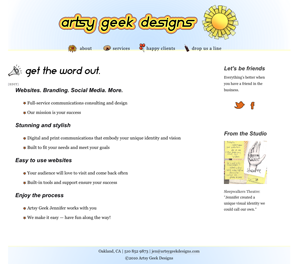
At first I really thought that I would keep Artsy Geek Designs at jenniferheller.com, and make it a subsection of this website (using the same WordPress install). I thought that would make it easier for me in the long run.

This design combined jenniferheller.com and Artsy Geek Design elements...it
I spent a full week putting it together to discover that the resulting website was confusing and hard to navigate. Finally, I broke down and bought a separate domain name. I was also running into troubles having to keep all my content in white boxes…though I love that look for jenniferheller.com, it was wasting many many design hours to keep that same aesthetic going on yet another website.

A few versions later, I had moved everything over to the new domain name and managed to solve the white boxes problem...
I really thought this design was a go, and was all set to release it. Something inside stopped me.
I called my dad. He suggested that it looked a bit like a coloring book (he’s not one to mince words) and had trouble pronouncing “Artsy Geek.”
I needed to hear that, but this feedback propelled me down one hell of a spiral…what do I do?? Do I change my name? I sought the counsel of many of my professional colleagues who felt that it was almost perfect just as it was. There was just something a little bit off…
I agreed.

A big believer in shopping locally, I loved the idea of incorporating Oakland in my design...but this was a dramatic departure, and following this path would require that I redo all my graphics...a long road I didn
Frustrated, I craved a really, really simple design.

My eyes were relieved, and I knew I was on the right track. My graphics seemed to pop out of this more neutrally colored site.
I decided to remove EVERY design element from my design (other than the logo header) and add them in slowly, mixing well, and letting my eyes rest between each addition. I discovered that I loved the way the graphics popped against a solid white background. A hint of sky, some exciting graphics in the nav menu and poof!

The resulting design was simple and straightforward.
Finally, I had a design which truly captured the essence of my design ethos, without distracting from what’s important (the content!).
I was sad to sacrifice my adorable cloud graphic, and my mom told me this morning that she misses it.

This little cloud guy is left to grace only this post with his presence.
I have to thank all of my designer and consumer friends who helped me along the way. I couldn’t have done it without you. I’m too hard to design for.
It has to be noted, that working with other clients can be a lot like this. It’s the nature of being a human and having a business–there are so many unique elements of you or your business, that it can be a fight to the death to figure out which ones fit together most elegantly.
It’s my job, as your web designer, to coax them out of you and into a stunningly functional and beautiful website. I’ve learned time and time again that as fun as that might be when working with others, when I work with myself, it’s like pulling teeth.

Leave a Reply