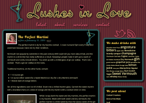
When designing the website for Lushes in Love, I set out to use all the amazing features available to those browsers that implement CSS3, but aimed to provide a viewing experience that degraded gracefully when viewed in Internet Explorer and older versions of other browsers.
 I wanted the blog to remind the viewer of neon lights and classy bars.
To accomplish this, I wrapped the posts in some padding, and a thick colored border with rounded corners and three box shadows. Two colored box shadows on either side of the border created the glow for the neon tube. One dark box shadow created the drop shadow against the background. I used the same technique for the glowing links.
Rounded corners and box shadows are new tools available to web designers, and as such are not viewable in all versions of IE and older versions of other browsers.
Though the site loses some of its glowing allure, it still looks great. I used graphics for the nav bar, background and header, so all is not lost!
 It has to be noted that I used the revolutionary ability to embed a font in a website to achieve the consistency between the post headers and the navbar and header image. The option of using Google’s Fonts in your website comes standard with Thesis, the WordPress theme I customize for all the WordPress websites I design.
I think it might be the best time to be a web designer ever. Certainly better than a hundred years ago, that’s for sure.

Leave a Reply